Google Maps gets a COVID-19 layer
-
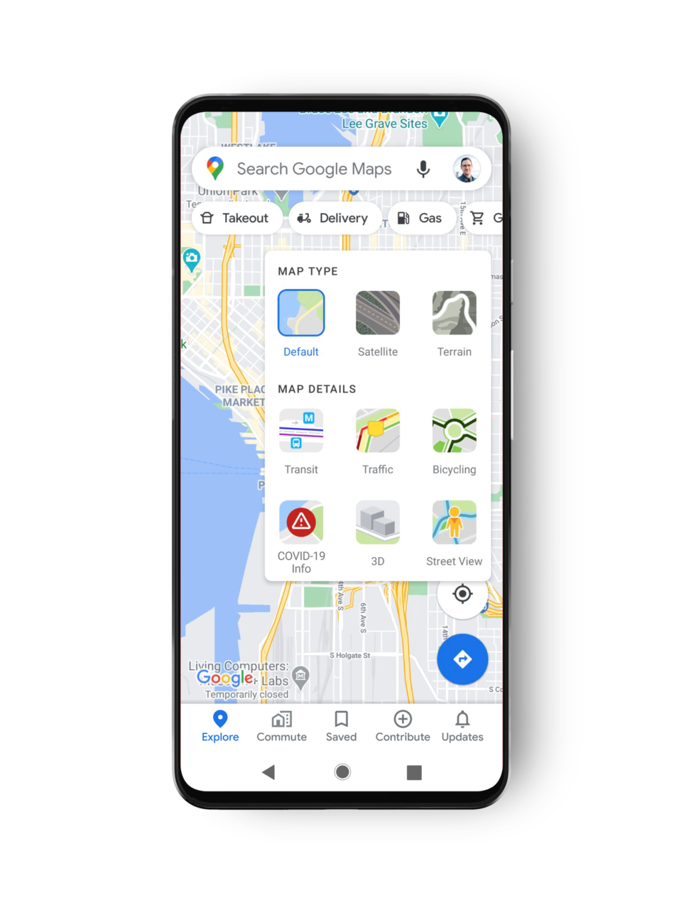
Tap the layer menu in the top right and press "COVID-19 info." [credit: Google ]
Google Maps is getting a COVID-19 overlay, meaning soon you'll be able to see pandemic data as easily as you can view satellite or traffic data.
Once the rollout hits your device, you'll be able to press the "layer" button and switch to a "COVID-19" view that will re-color the map. Google says the overlay is a "seven-day average of new COVID cases per 100,000 people for the area of the map you’re looking at." Users will also get an arrow indicating if the numbers are trending up or down. Here's the color code:
- Gray: Less than 1 case
- Yellow: 1-10 cases
- Orange: 10-20 cases
- Dark orange: 20-30 cases
- Red: 30-40 cases
- Dark red: 40+ cases
Google says the information comes from "multiple authoritative sources, including Johns Hopkins, the New York Times, and Wikipedia." I wouldn't quite call Wikipedia an "authoritative source," but Google notes that "these sources get data from public health organizations like the World Health Organization, government health ministries, along with state and local health agencies and hospitals."
Read 1 remaining paragraphs | Comments
from Tech – Ars Technica https://ift.tt/3kJKHJx


Comments
Post a Comment