Android 12’s beautiful color-changing UI already lives up to the hype
-

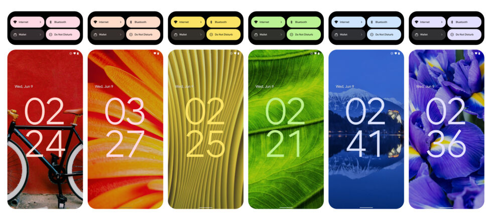
With Android 12 Beta 2, Google's color-changing UI is live, so we took a trip around the rainbow. [credit: Ron Amadeo ]
Android 12 Beta 2 came out this week, and with it, a lot of features we've only been able to see screenshots of now actually work. This includes Android's ambitious color-changing UI codenamed "Monet," and even though this is only a beta, after some hands-on time, it feels like Android 12's chameleon-like UI already lives up to the hype.
Monet—or "Material You," as Google now wants us to call it—effortlessly recolors your phone UI with a matching theme based on your wallpaper. Pick a wallpaper that is primarily blue and Android 12 will change the buttons, sliders, clock, notifications, and settings background to matching shades. This arrangement sounds like something that can't possibly work outside of an onstage tech demo, but the code is out now, and it really works. I've spent the last day maliciously trying to break it, and Android 12 reliably turns in beautiful color schemes without any contrast issues.
Google has been working on wallpaper-defined color schemes for some time, starting in Android 5.0 Lollipop and the "Palette" API back in 2014. Monet represents a second-generation swing at the idea, and while Android 5's Palette API was barely used, Google now feels confident enough with the idea to use it basically everywhere. Basically, every piece of the Android 12 system UI other than the permanently black Quick Settings background is subject to the systemwide color coordinator.
Read 6 remaining paragraphs | Comments
from Tech – Ars Technica https://ift.tt/3gdY8C1
Comments
Post a Comment